LOGO
Michigan holds a unique strategic position in relation to the North American Free Trade Agreement between Mexico and the United States.
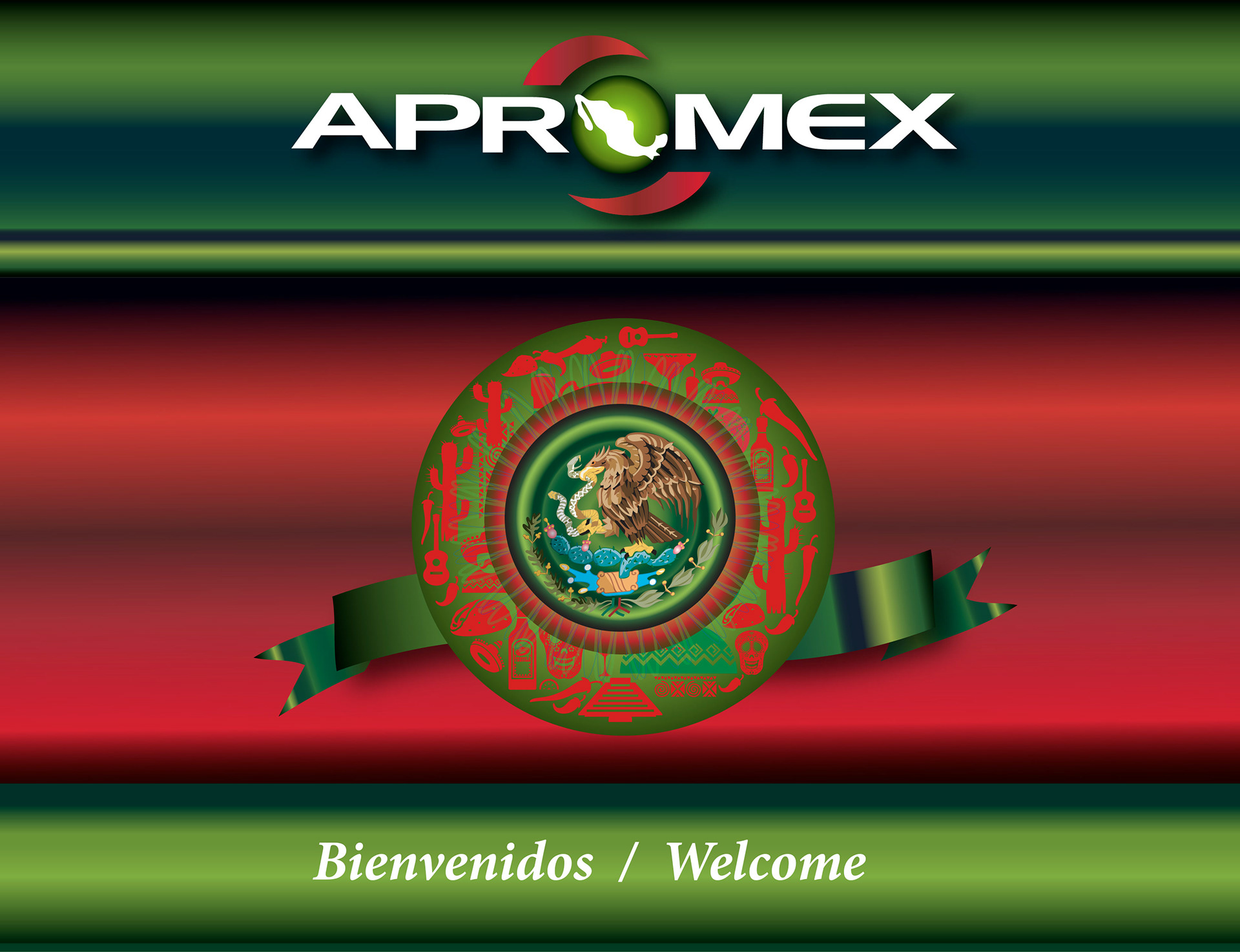
It was within this context that the Association of Mexican Professionals in Michigan (APROMEX) was formed. APROMEX is a non-profit organization created to link Mexican Professionals in Michigan. Emphasizing the network opportunities between members, companies and other organizations.
In this project one of the challenges was to create the complete branding for APROMEX. Including name, logo, and all the marketing promotional for the events the organization has through the year.
The first step was the creation of the name. The name selected by its members was "APROMEX" taking the initial "A" for Association. Then the prefix "pro" from Professionals and also from the Latin words that indicates: forward. The second part of the name is "MEX", referring to "Mexico" as the country where the members are from.
The corporate colors were green, red and white. They were based on the colors of the Mexican flag. As a part of the abstract elements was the incorporation of a circle that gives the idea of globalization in which Mexico is part of the North American Free Trade Agreement with USA. Finally was completed with the Mexican map and the red abstract spiral elements with the idea of the Association is open to new ideas, members, and activities at the same time of movement. The typography used is Arial for simple, clear, which gives the right balance to the logo.
The computer programs used in this project were Indesign, Illustrator and Photoshop and PowerPoint.

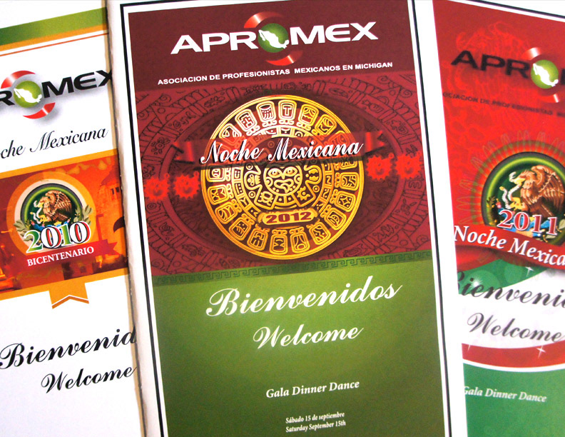
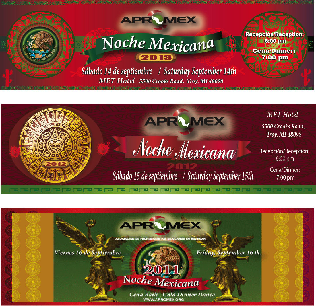
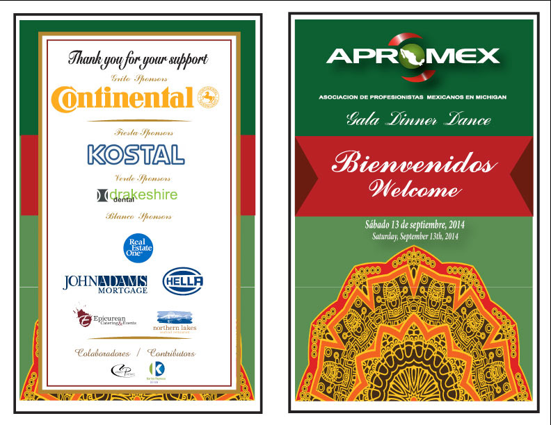
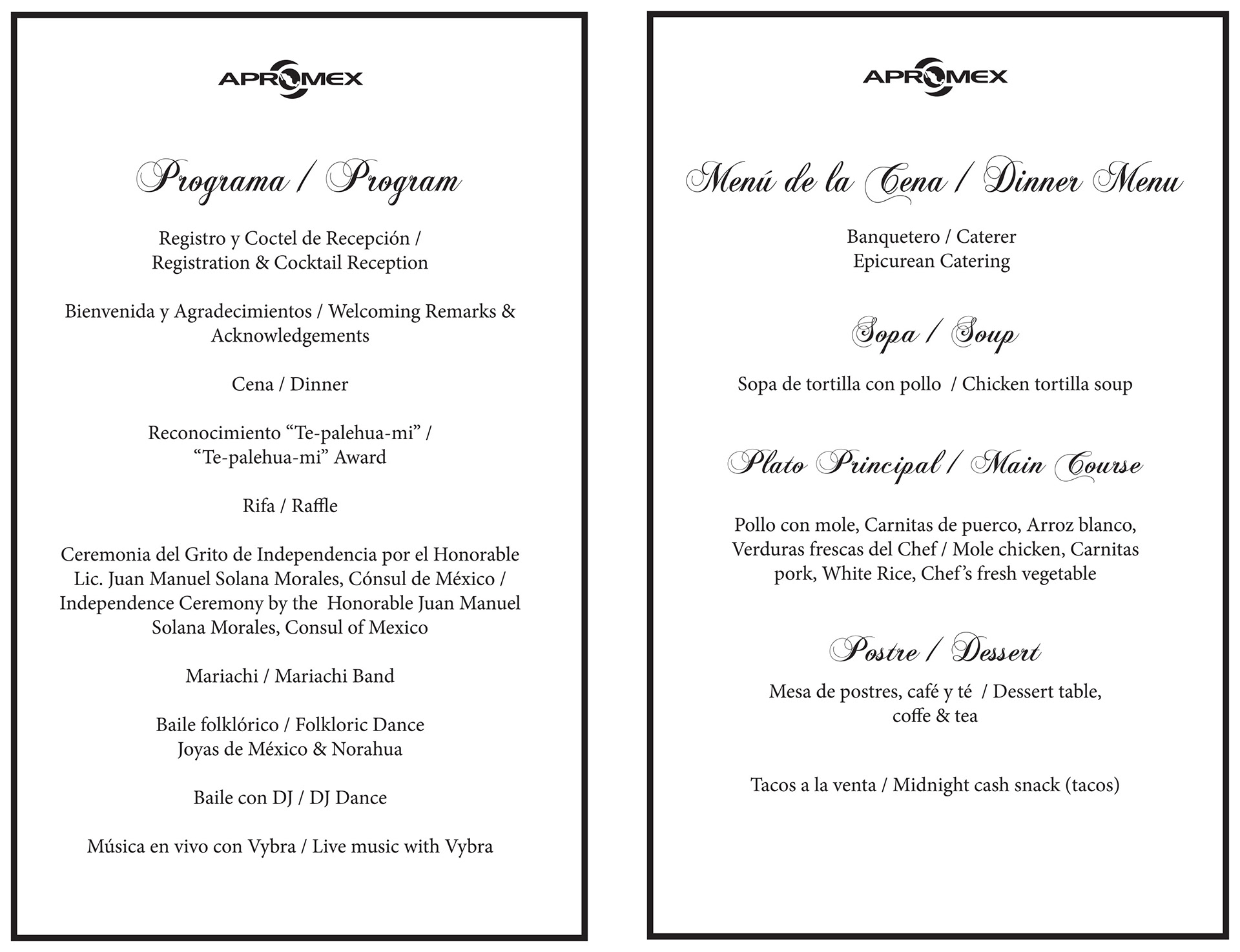
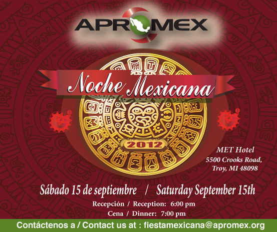
Every year the Association organizes a Gala Dinner Dance: "Noche Mexicana" to commemorate and celebrate the Mexican Independence day.
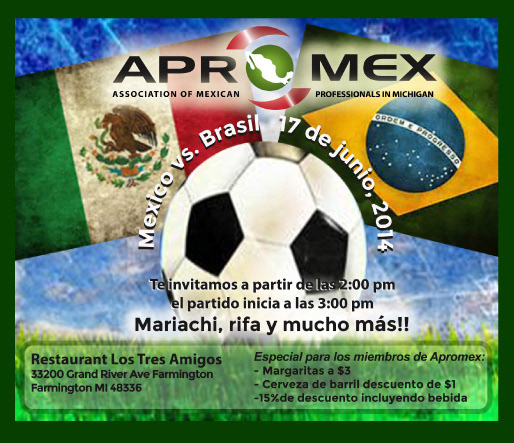
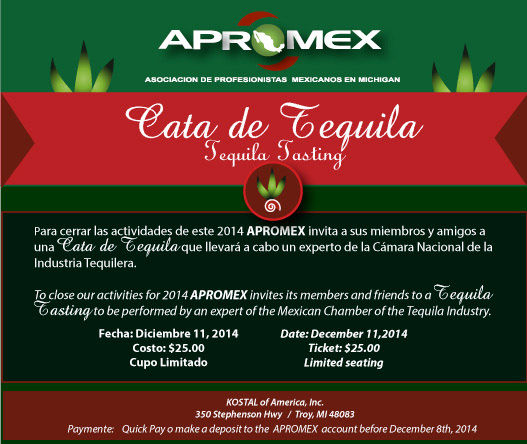
Designs of menus, tickets and web banners to promote the event every year.
WEB BANNERS
DESIGN OF PROGRAMS FOR SPECIAL EVENTS
WEB BANNERS


POWERPOINT PRESENTATION